Intranets come in all shapes and sizes. Choosing what style works best for your company can be daunting. How do you know what information to include, what features will engage your employees, and what intranet solution will be easy to implement and maintain? These intranet design examples will give you some inspiration and ideas.
Before making these decisions, it’s best to keep in mind the core objective of an intranet: to be a centralized location for connecting employees to company information. It should reinforce company culture and brand values while providing valuable tools and resources for your employees. A modern intranet platform has all the features you need to build a single source of truth for your team.
So, with that, where do you start? We’ve collected various intranet samples from the MangoApps platform to inform and inspire your company’s intranet endeavor. You’ll find many influential features within MangoApps’ home, company, and department pages throughout the following intranet samples.
Homepage/Dashboard Intranet Design Examples
Your intranet’s homepage, or dashboard, works as your employees’ initial gateway to the resources and information they need to collaborate and execute better. With MangoApps’ widget-based intranet layouts, you can set homepages to include a specific set of widgets for every employee or a customizable set, so each employee can navigate what’s most important to them.
Easily rearrange widgets’ positions and sizes to create a unique homepage for your users that gets them to all the essential intranet features. With over 50 widgets to choose from, your company’s dashboard is customizable to match your particular needs.
Manufacturing Intranet
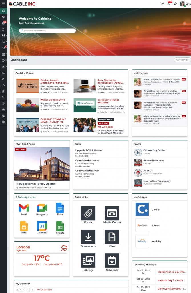
In the first of our intranet design examples, CableInc highlights the search bar at the top of the page. This encourages users to take advantage of the search function first rather than reaching out for help right away.
Access to company news (CableInc Corner) and must-read posts keep users informed, while Task and Notification widgets ensure users are up to date with their duties. Plus, quick links to apps and team workspaces make navigation easy.
With a mix of company news & announcements and helpful user tools, this homepage is an excellent example of information distribution, task management, and resource consolidation.
Retail Intranet
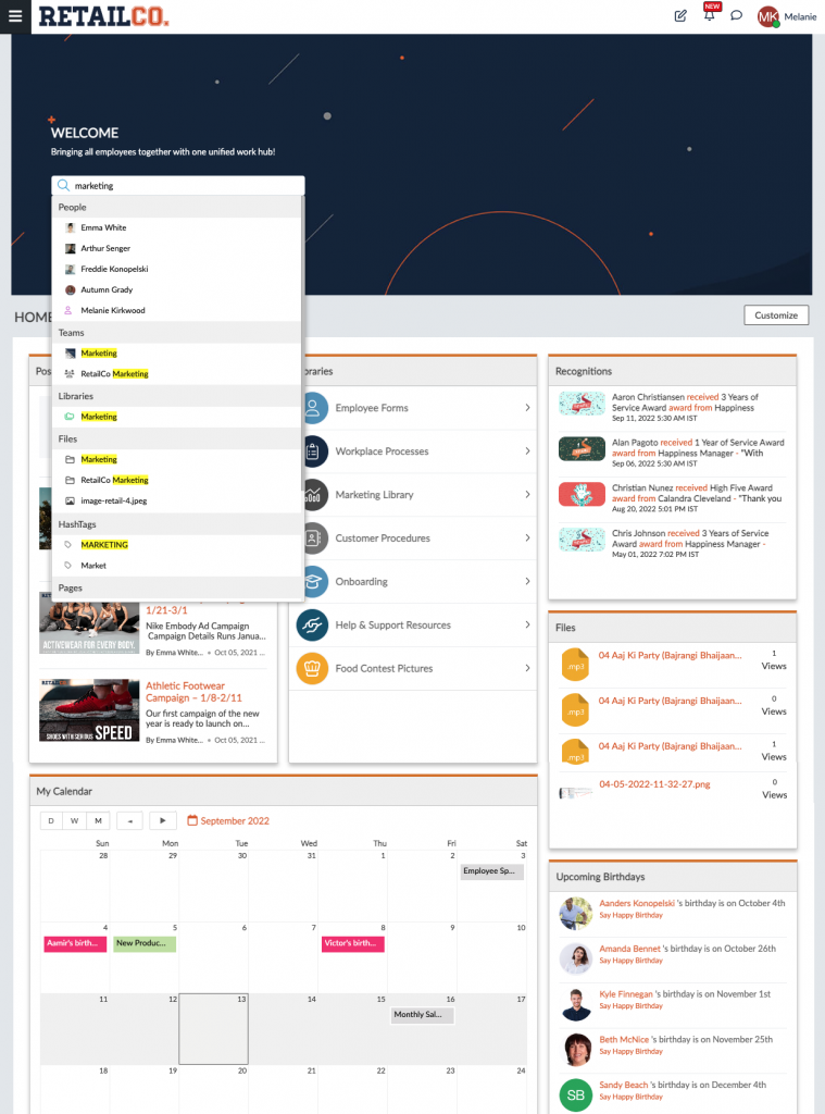
At RetailCo, they’ve chosen to emphasize teamwork and their repository of resources. With the employee recognition widget, users are informed of their coworker’s successes. The Upcoming Birthdays widget allows users to acknowledge and send greetings to one another.
Easy access to the RetailCo library (which includes workplace procedures, employee forms, marketing materials, etc.) and recent Files allows users to quickly find the tools they need.
This intranet sample also consists of a calendar and company news. With those, users get a convenient glance at what’s ahead for the company.
Healthcare Intranet
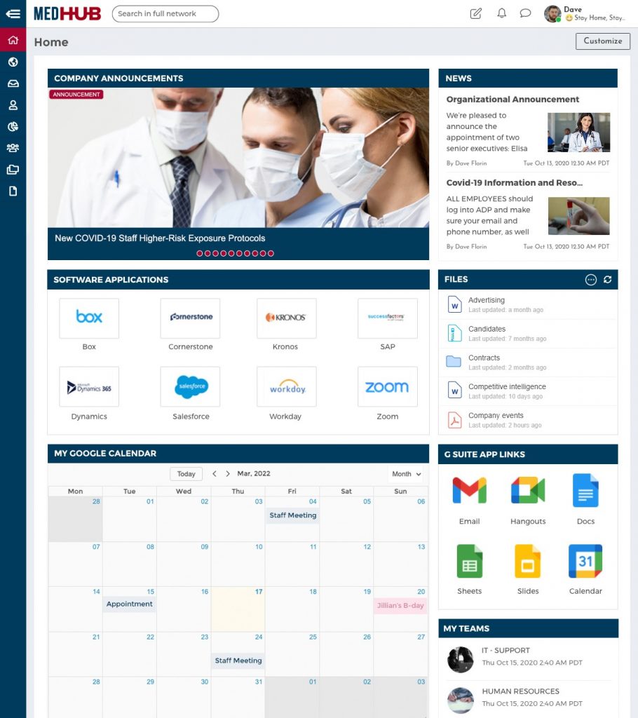
In this intranet sample from MedHub, the homepage highlights company announcements and accessible apps.
As a healthcare facility, MedHub needs its employees to be up to date with guidelines and procedures. Placing the Announcements widgets top left ensures updates are quickly seen and acknowledged.
With MangoApps’ single sign-on (SSO) capabilities, MedHub can place its commonly used apps and Google integrations on its homepage. Single sign-on makes it easy for healthcare workers to access their necessary tools while maintaining security.
Airline Industry Intranet
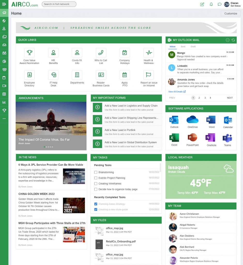
This AirCo homepage is nothing but efficient. While Announcements and News widgets are on display, AirCo chooses to put performance front and center.
With Quick Links, Outlook Mail integration, My Teams, and a Forms widget, this user can conveniently jump from app to app for up-to-date communications and easily accessible work tools.
And, with a dynamic Weather widget, this intranet design example showcases an additional feature handy for those in the airline industry.
Tech Industry Intranet
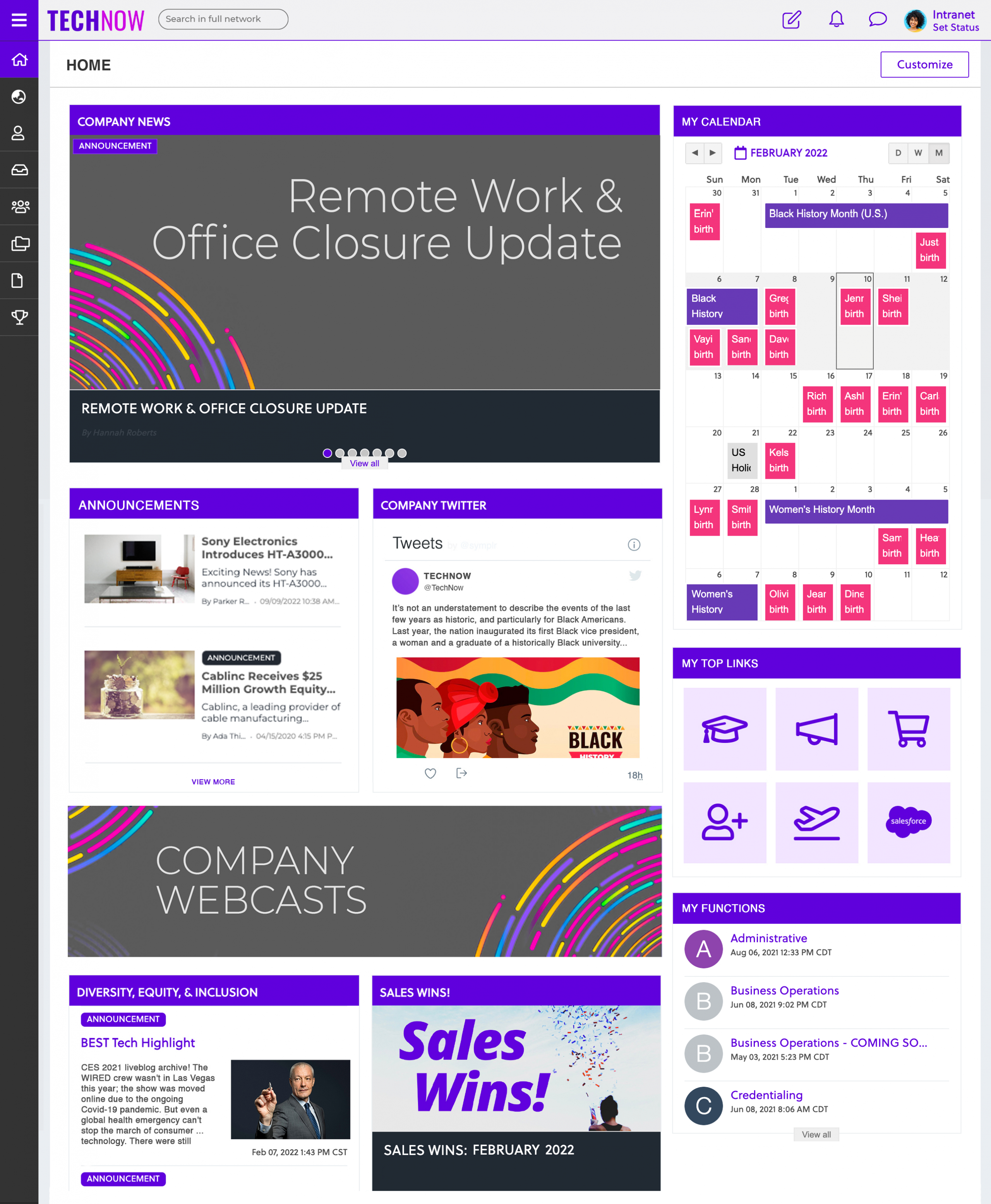
TechNow’s homepage puts a focus on company news & updates. Taking up two-thirds of the page, company news, announcements, webcasts, and Twitter feeds keep users updated on various aspects of the company.
On the right, users can glance at calendars, access frequently used links, and effortlessly find resources within their library. As an intranet sample, TechNow’s homepage is a first-rate example of how to keep employees informed and engaged.
Food Industry Intranet
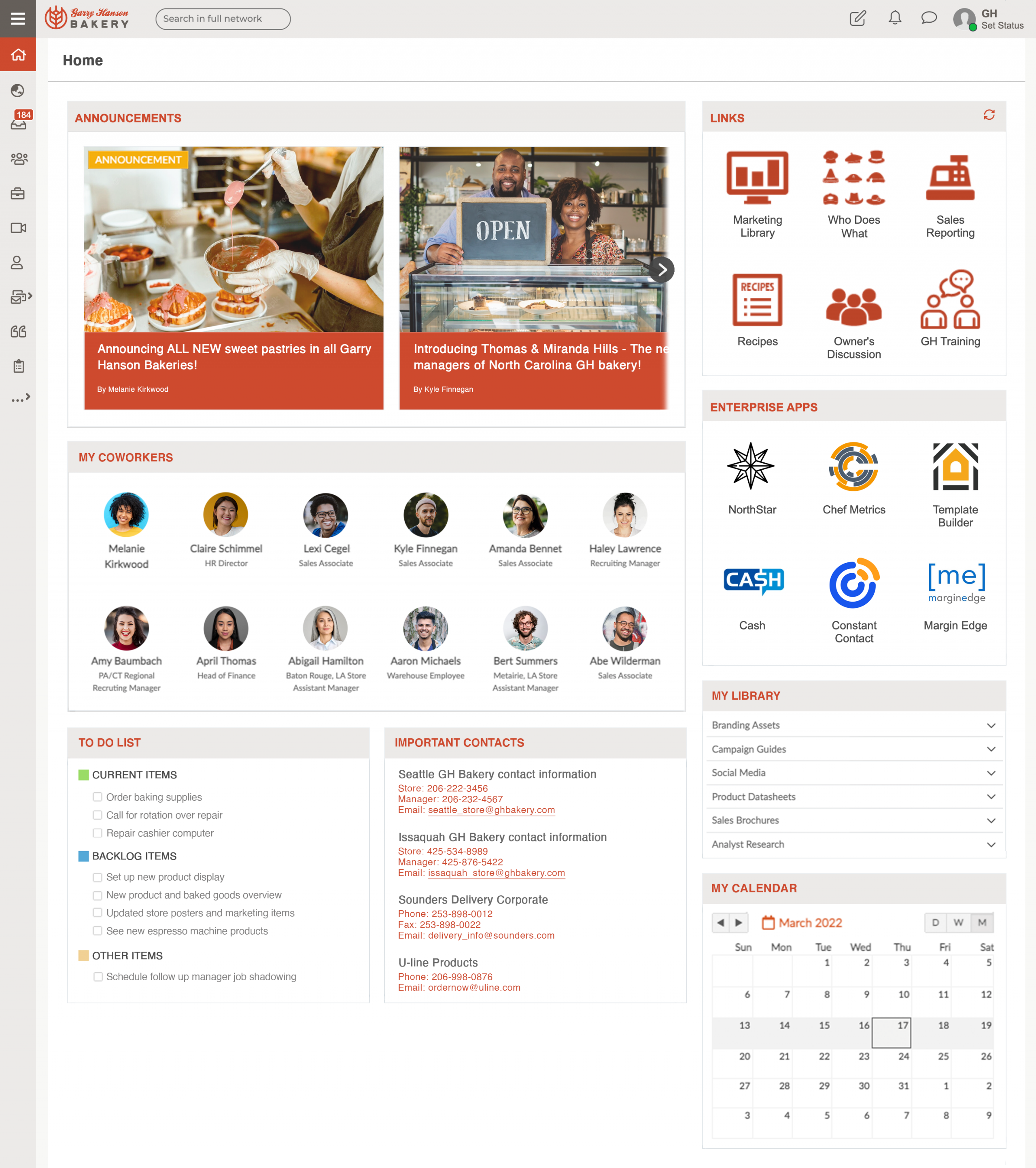
This intranet sample from Garry Hansen Bakery has people and productivity as its primary focus.
With the My Coworkers widget, employees of Garry Hansen Bakery can discover and connect with colleagues from across locations. The Important Contacts widget ensures contact information for stores, office locations, and management are readily available.
A to-do list, along with quick links, enterprise apps, resource library, and a calendar, allows users to stay productive. With fast access to essential tools and information, the employees of Garry Hansen Bakery are efficient.
Finance Industry Intranet
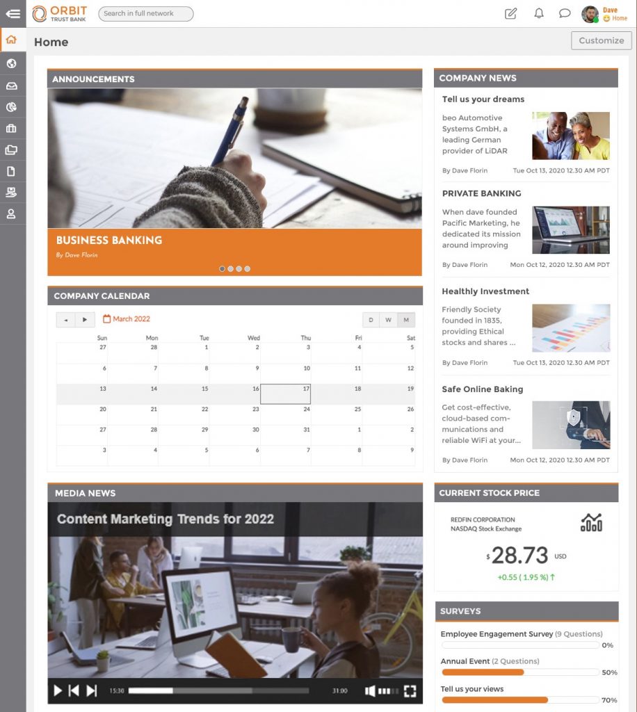
Orbit Trust Banking chooses to highlight information and engagement on this sample intranet homepage.
With assorted posts widgets displaying Orbit’s company information and a stock widget, this financial institution’s dashboard conveniently informs users on various topics.
The company Calendar and Surveys widget keep users engaged. A clear view of upcoming events and meetings allows users to visualize what’s going on in the company. And surveys give users a chance to provide feedback and have a voice within their workplace.
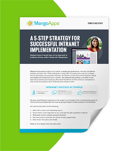
How To Build A Useful Intranet
- Start with a vision and buy-in from leadership
- Ask the right questions during demos
- Relinquish control and get everyone involved
- Get executives to promote the intranet at every opportunity
- Start small, grow, and iterate
Company and Department Sites
Company and department sites provide employees easy access to important company content and information. They are a curated, centralized location where employees can access corporate communications, company policies, processes, benefits, and more.
Incorporate static and dynamic content on your company and department sites. A mix of content ensures users can easily connect with and find current, relevant information and handy resource links. Read our intranet engagement ideas for some more ways to ensure that you do this effectively.
Government Agency Company Site
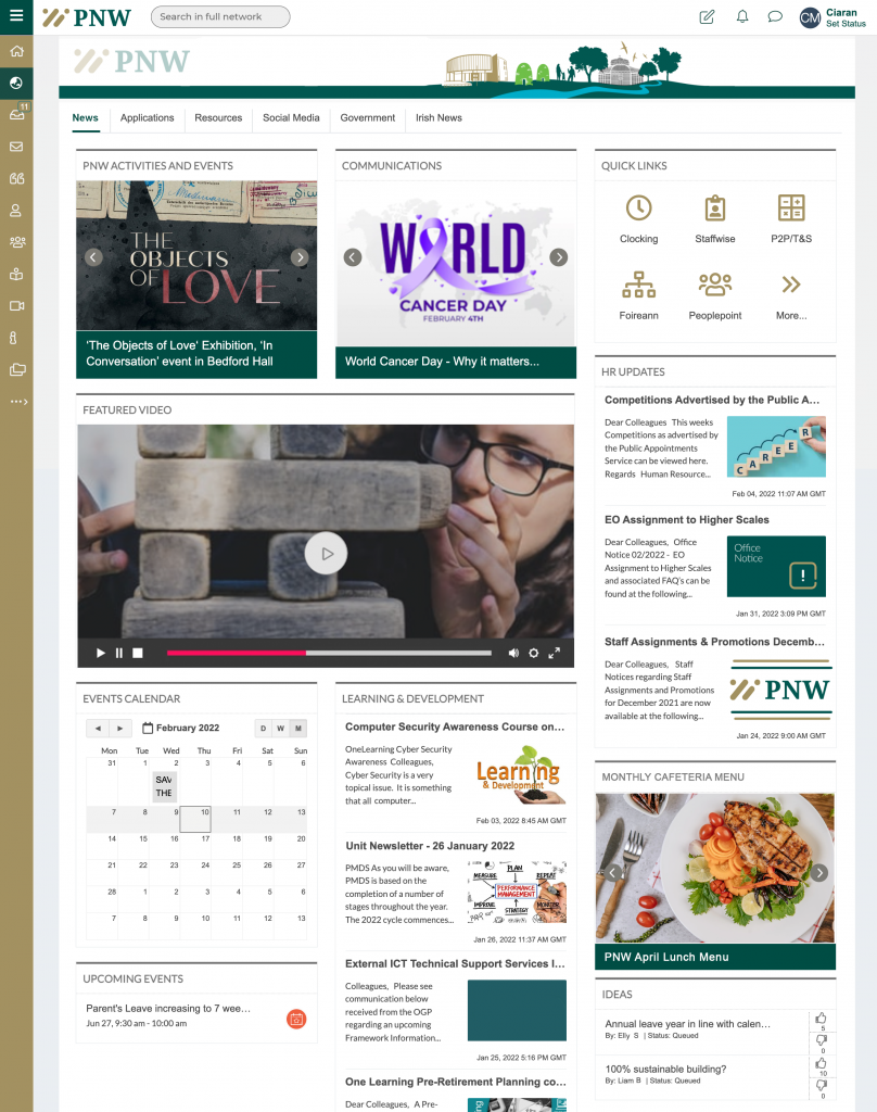
PNW’s Company Site spotlights a few of their different departments, company-wide activities, and events.
Their Communications, HR, and Learning & Development departments each have their own space for updates, allowing all users a glimpse into departments other than their own.
Towards the bottom of the page, PNW has implemented an ideas widget, where users can submit suggestions, and a company lunch menu. These items show PNW’s investment in keeping its employees active and engaged.
Healthcare Industry Company Site
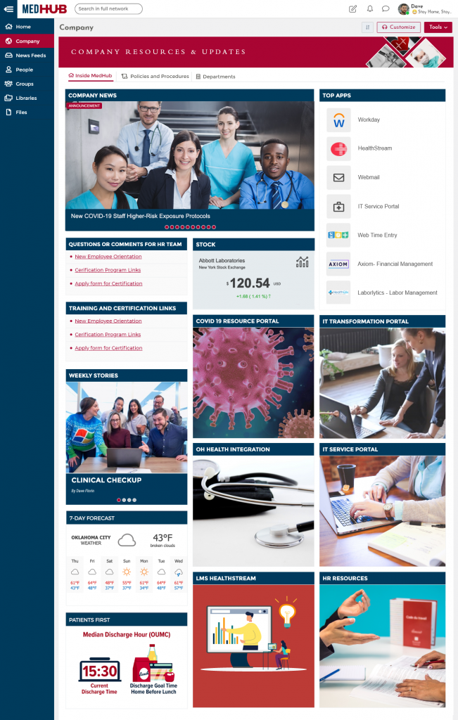
Unlike the other intranet design examples you’ve seen so far, MedHub’s Company section includes an additional page for Policies & Procedures. An independent Policies & Procedures page lets clinicians quickly find the information they need for essential patient communications.
The HR widgets, including Questions & Comments and Training & Certification links, ensure users are just a click away from continued education, up-to-date regulations, and any questions they may need answering.
MedHub also has dedicated spaces for IT Services and COVID-19 policies, both crucial to keeping current healthcare facilities running smoothly.
Finance Industry Company Site
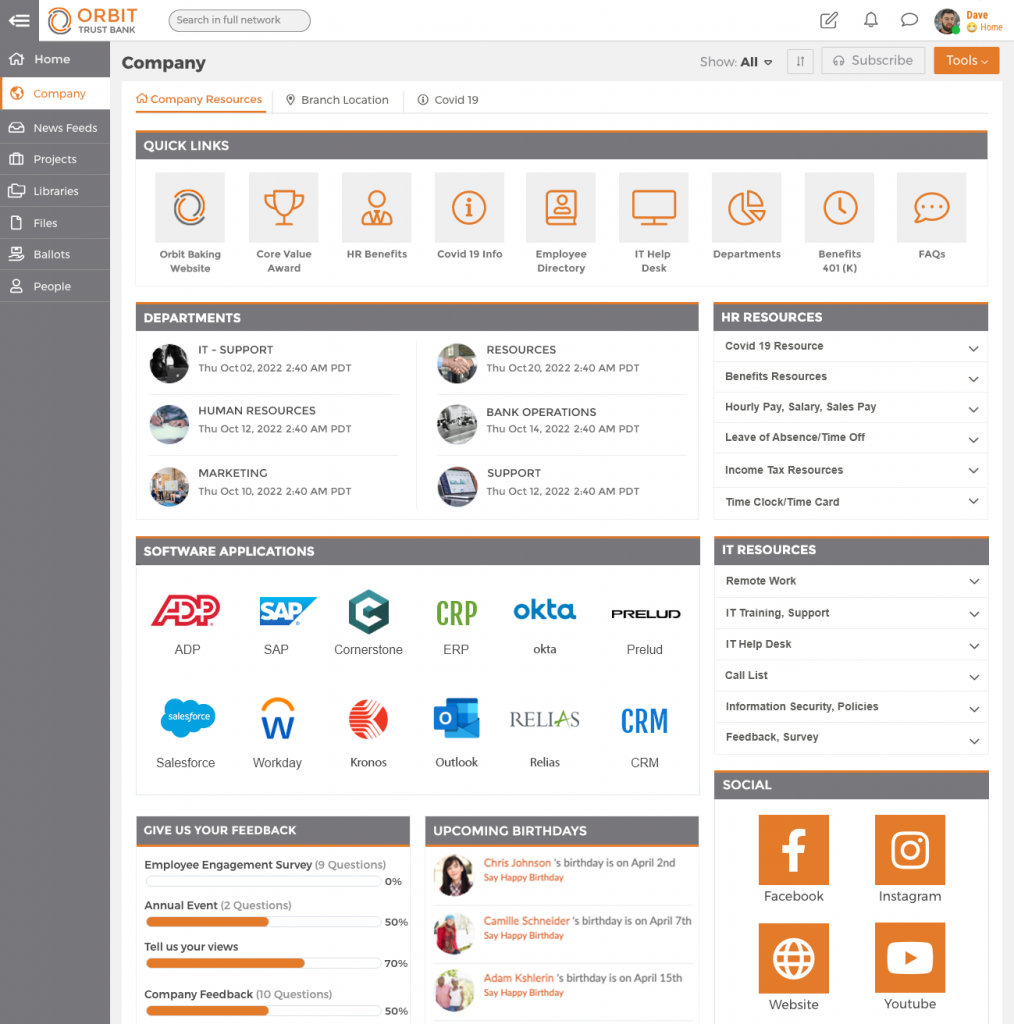
Orbit Trusts’ Bank has a straightforward, resource-filled company site. Their leading focus is to have employee tools readily accessible. Including quick links, software apps, department pages, and HR & IT resources, their company page sets their employees up for success.
Links to Orbit’s social accounts, upcoming birthdays, and feedback surveys show they don’t just provide tools for their employees but ways for their employees to engage and amplify voices, as well.
Tech Industry Company Site
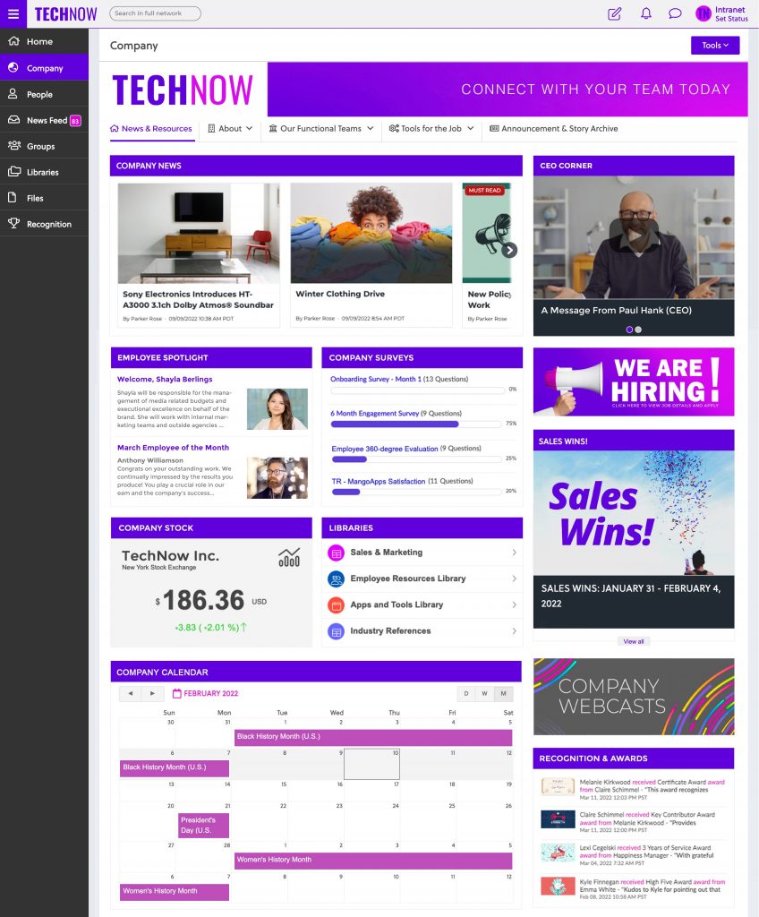
The company site on TechNow’s intranet design example shows a nice mix of company-wide news, updates, and cultural content.
Its employee spotlight and recognition widgets flaunt TechNow team members, showing appreciation. The Now Hiring widget informs employees of the possibility of promotions and rewards, encouraging folks to apply from within or share the listing with friends.
TechNow’s CEO Corner adds a personal touch to potentially distant corporate communications.
Housing Industry Company Site
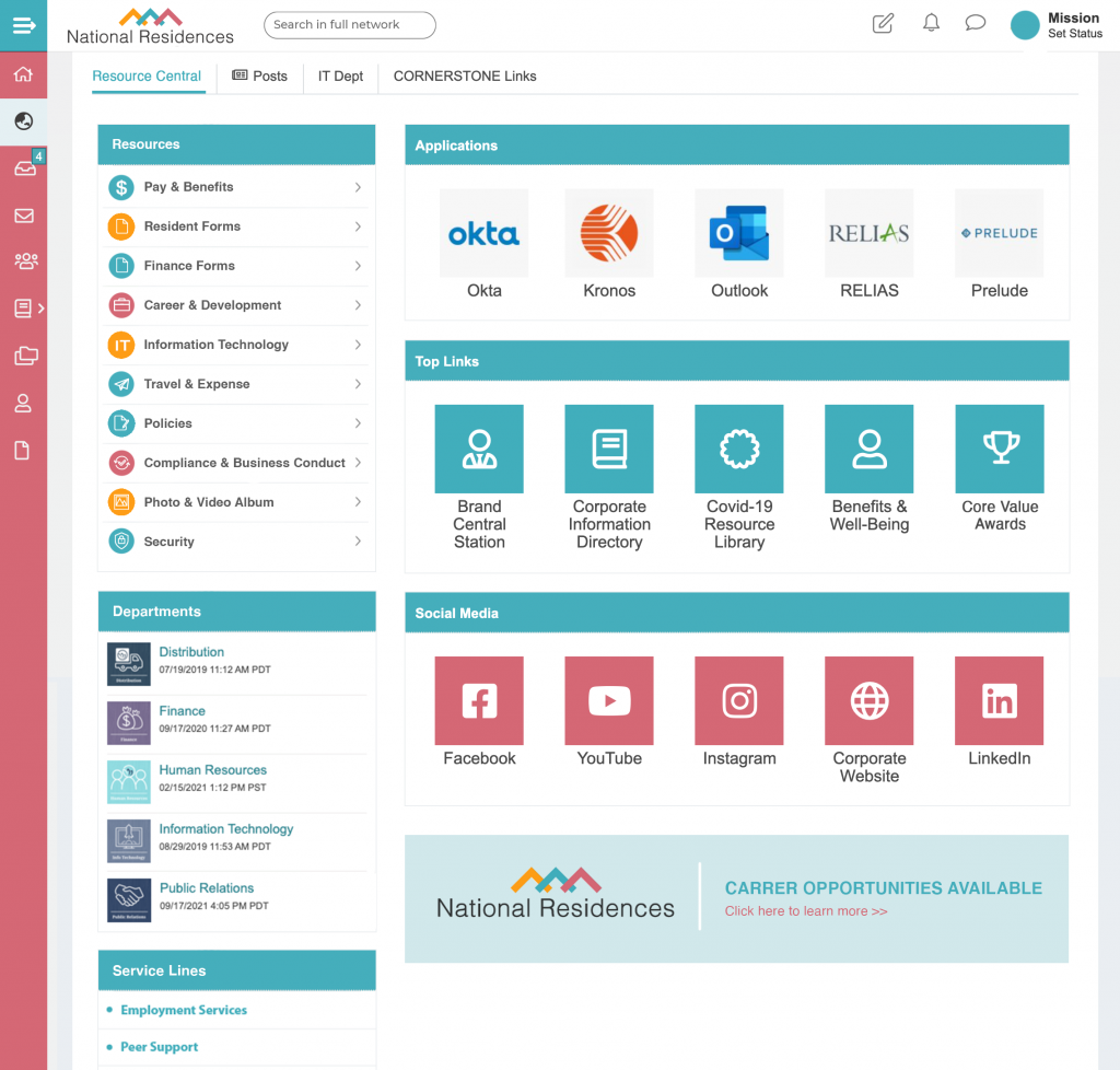
This company site from National Residences’ intranet sample has a rigid layout consisting entirely of company content like resources, links, departments, and social media.
They wisely use a top slot for the search bar, nudging employees to take advantage of it. With plenty of white space and consistent use of icons, National Residences’ company page comes across as clear-cut and easy to navigate.
Hospitality Company Site
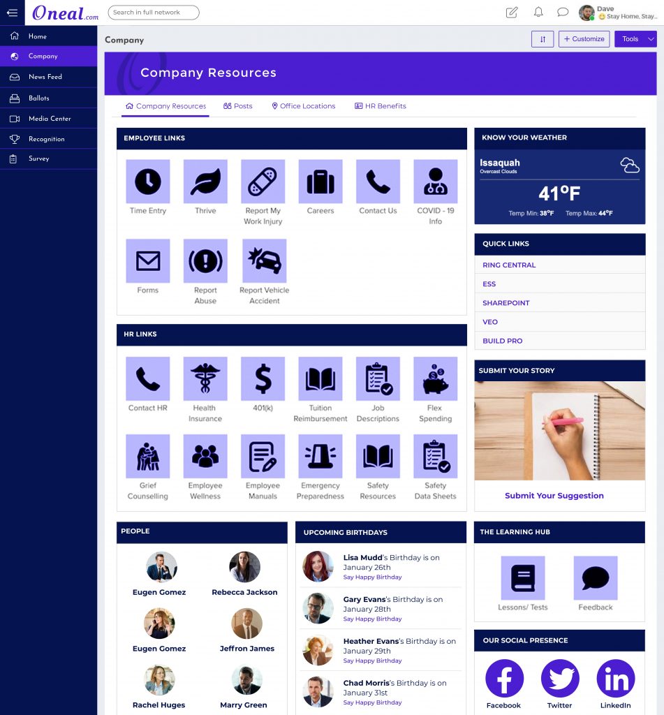
Oneal has used its Company Site to display a mix of links, resources, and cultural content.
This page includes a Birthday widget and story submission form to build community. The people widget ensures employees can quickly contact their closest colleagues for efficient collaboration and information sharing. And the learning widget makes accessing necessary training modules a breeze.
This sample intranet page is a striking example of being both enterprising and engaging.
IT Department Page
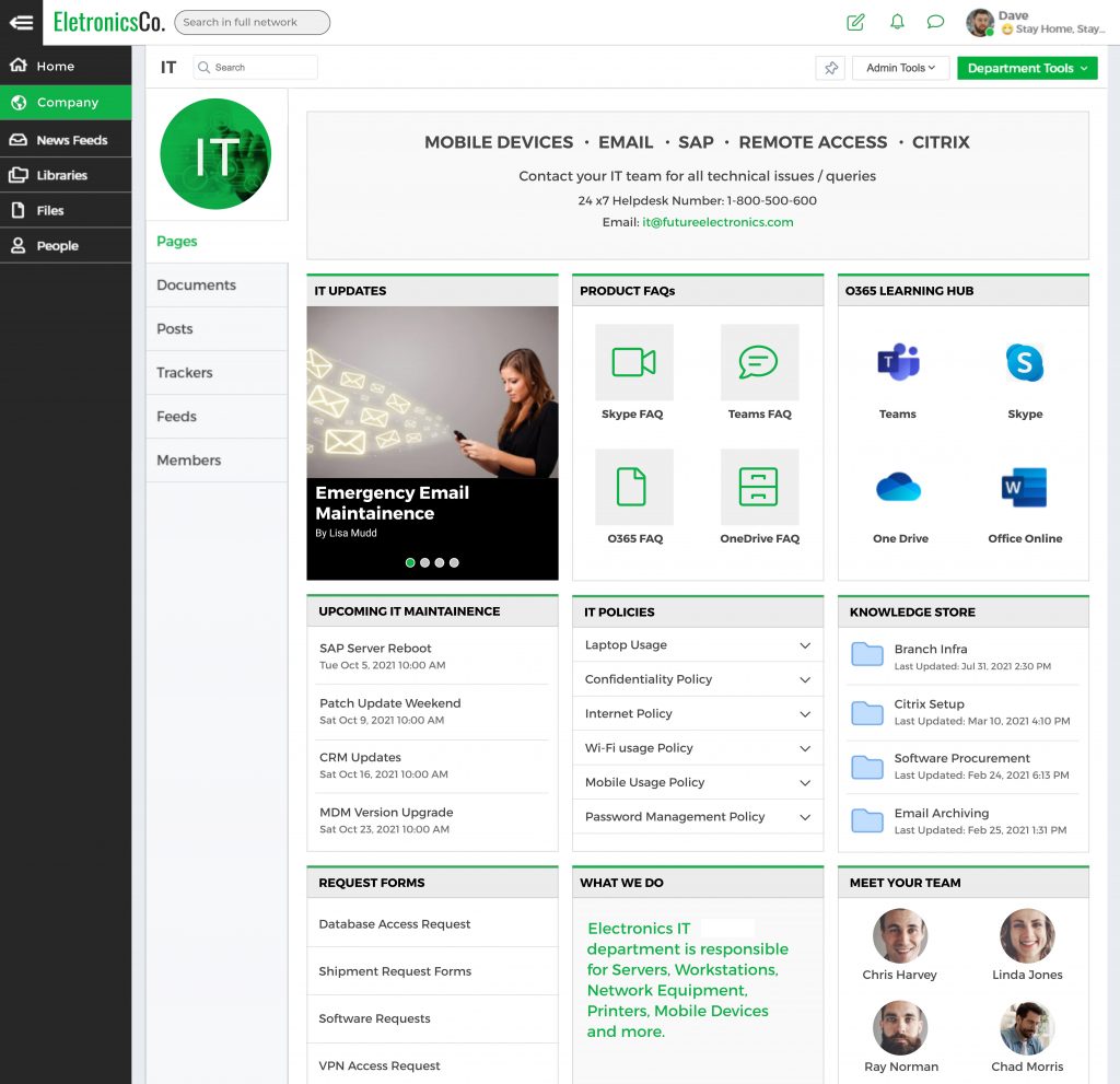
Department pages give users quick access to department-specific information. On this IT department page, ElectronicsCo has built a fruitful collection of resources.
From product FAQs and request forms to upcoming Maintenance and IT policies, ElectronicsCo has taken advantage of various widgets to keep users informed.
With the addition of the IT team widget, intranet design examples like this one put faces to the department, encouraging users to reach out if their question is left unanswered.
HR Department Page
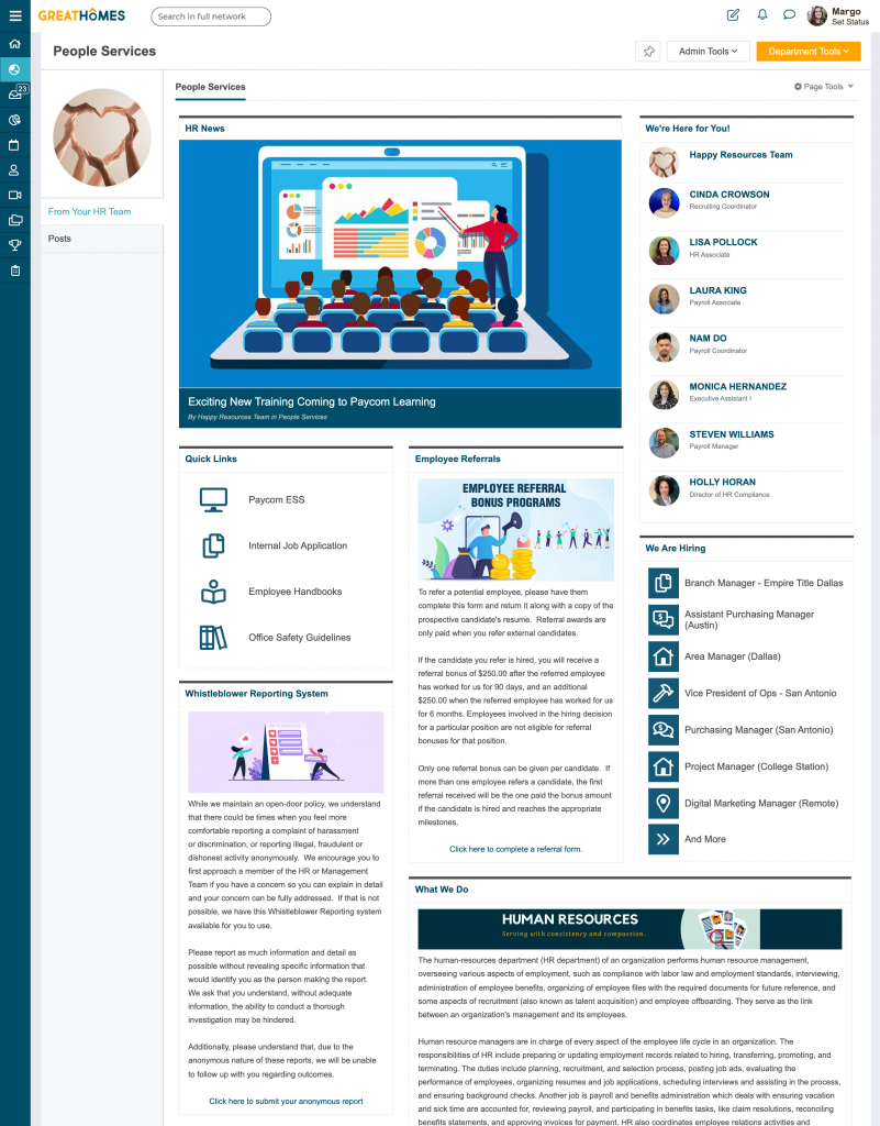
This HR department page from GreatHomes showcases what an HR department is all about – transparency and helpfulness.
The people widget encourages employees to contact department members directly, while the quick links provide convenient access to common HR-related resources.
The additional widgets featuring Now Hiring and employee referrals are inspiring and incentivizing, adding to employee engagement and company culture.
Learning & Development Department Page
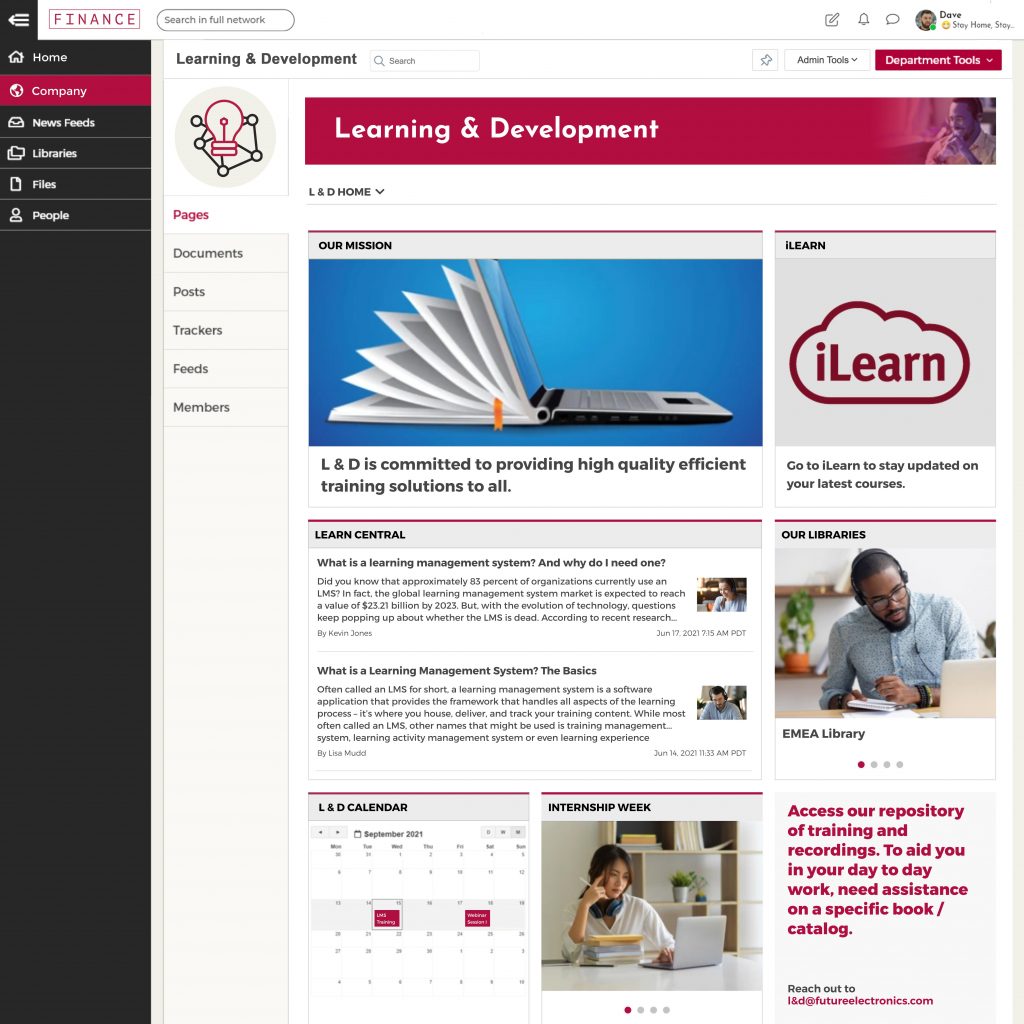
This intranet sample features a Learning & Development department page, emphasizing the department’s mission statement. It details what they do, how it works, and why it’s imperative.
Along with its many resourceful links to courses, libraries, and more, the calendar and Internship Week widgets bring a sense of community to the page. While this page leans mostly on informative text, its sparing use of photos & graphics still creates movement, encouraging users to browse the entire page.
Learn More
With these intranet samples, we hope you’re inspired to create the ideal digital workspace for your organization. As you can see, MangoApps makes connecting employees to colleagues and company resources easy. To learn more, read our in-depth intranet whitepaper, learn intranet best practices, or check out customer stories from TeamHealth and Great Harvest Bread.


